
Services
UX/UI Design
Wireframing
Prototyping
User Research & Interviews
Sector
Rail
Engineering
Overview
This project focused on the design of an in-cab Driver System, a critical upgrade from legacy radio-based communication to a tablet-mounted digital interface aimed at enhancing rail safety and situational awareness. The system provided real-time GPS-driven updates on speed conditions, signal status, and operational warnings to train drivers.
The goal of this project was to:
- Understand the current process and user group.
- Design a people-first system, that is functional and prioritises safety.
Project scope
Audience
Our audience was current drivers of the trains:
Predominantly male (95%).
Aged between 45–60 years.
Limited familiarity with modern digital interfaces.
My role and responsibilities
As UX/UI designer for this project, I was responsible for the end-to-end design of an MVP workflow. I worked collaboratively with the Engineering, Projects and Sales Teams in the initial research and data-gathering phase, and then handed over to our Software team to bring it all to life.
Tools used
Adobe XD, Miro, Adobe Creative Suite
My process
1. User & Stakeholder Research
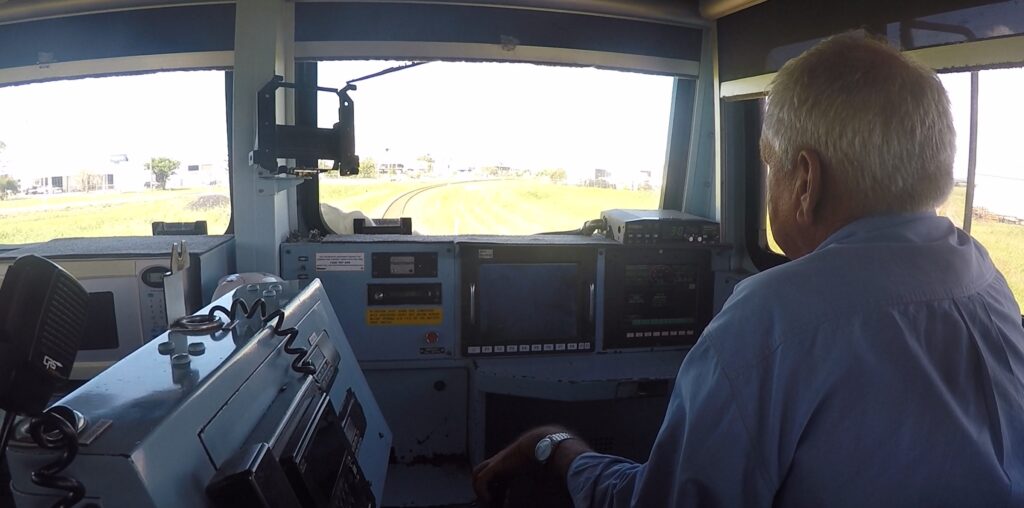
To build empathy with end users, we conducted contextual interviews and on-job observations with train drivers.
From our research we found:
- High cognitive load when interpreting multiple sources of information with the additional of having to manual input crucial information.
- Limited speed alerts and driver information.
- Physical interface limitations due to vibration and limited space in the cab.

2. Problem Statement
Based on the research, we framed the core design challenge as:
“How might we deliver real-time operational updates to drivers in a way that enhances situational awareness without adding to their cognitive load?”
We defined clear user needs, such as:
- Immediate visibility of critical alerts.
- Simple interaction with minimal training required.
- Reliability in low-connectivity environments.
3. Concept Development
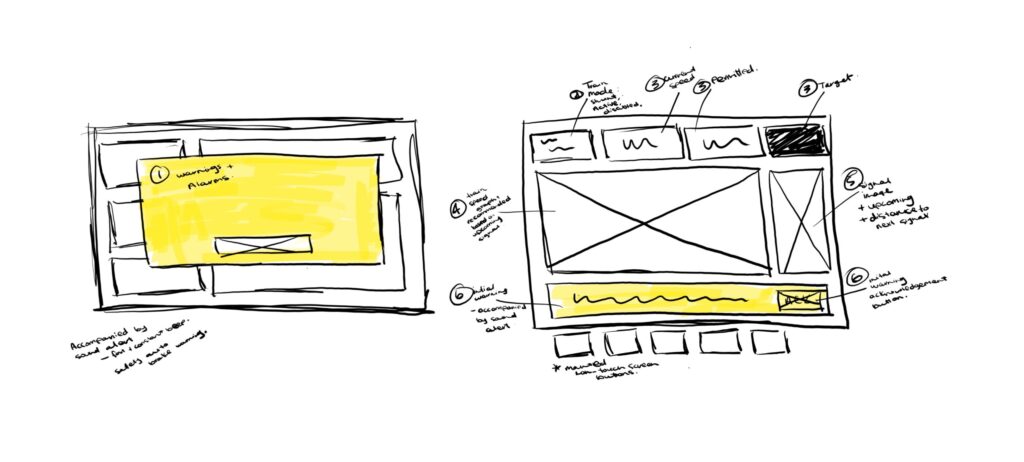
We explored multiple layout concepts through sketching and low-fidelity wireframes. To ensure alignment with human-centred design principles.
Collaborating with engineers, I translated technical system logic into understandable interface flows, simplifying language and incorporating familiar icons.

4. Prototype development
I created interactive prototypes using Adobe XD, focusing on:
Large tap targets for our users larger hand size.
Colour-coded alerts adhering to accessibility standards (e.g. colour-blind optimisation, contrast ratios for visibility in bright sunlight).
Persistent display of speed limits and current train speed with an industry standard ‘train graph’.
5. Usability Testing & Iteration
We conducted multiple rounds of usability testing with actual drivers using scenario-based tasks. Feedback led to key improvements such as:
- Consolidating warning messages into a single alert panel.
- Simplifying the navigation structure to reduce steps during critical moments.
- Adjusting lighting modes to include a ‘dark mode’ for operational night hours.
Outcome:
The final design was validated by both operational and technical stakeholders. It achieved the project’s goals of improving safety, delivering information in real-time, and reducing reliance on verbal communication. The design has since entered pilot deployment for further evaluation in live rail conditions.
Please note: Due to intellectual property and confidentiality agreements, I am unable to publicly display the final designs for this project. However, I’d be happy to discuss my design process, approach, and outcomes in more detail upon request.